Enaya Care, one of Saudi Arabia's biggest salon and spa chains, had grown to serve distinct audiences under one identity. The challenge was to evolve its visual system into a contemporary wellbeing experience, establishing a clear brand architecture that gives Men, Women, and Kids their own distinct personalities while keeping every touchpoint recognizably Enaya Care.
TITLE
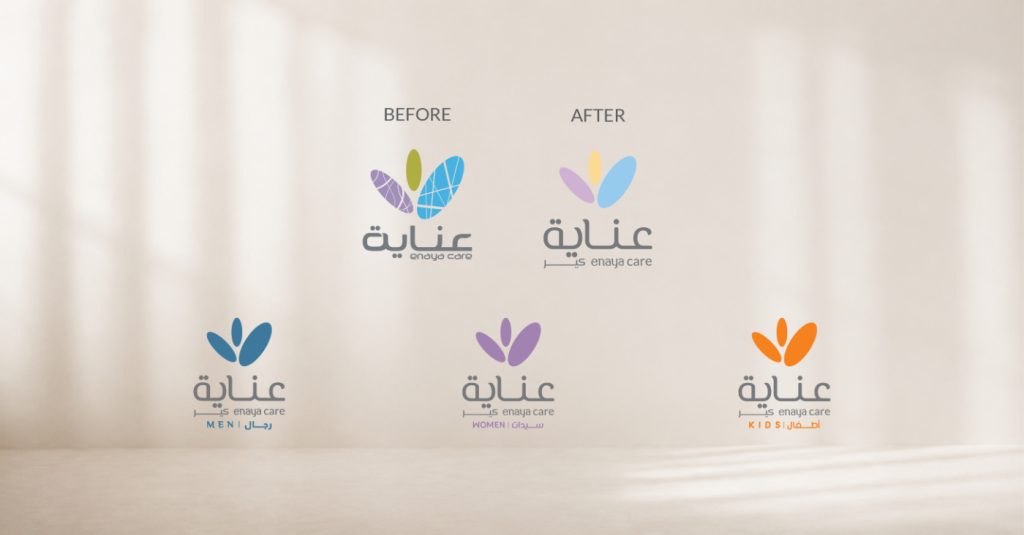
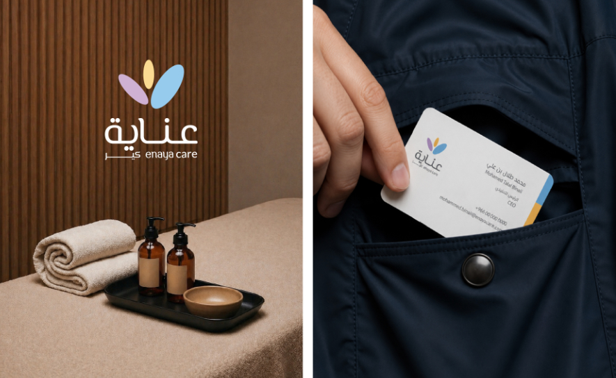
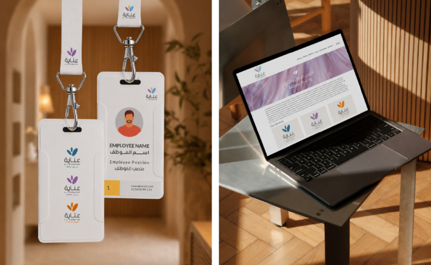
The rebranding simplified the visual mark away from a busy, clinical aesthetic toward a cleaner, warmer, and more contemporary expression of care. The master identity serves as the foundation, anchoring a unified logo system that cleanly splits into dedicated expressions for Men, Women, and Kids.
Project Year
2025
Client
Enaya Care
Project Type
Rebranding
Industry
Health & Wellness
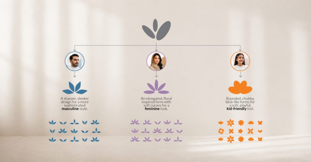
A structured hierarchy translates the core emblem into three distinct visual personalities based on tailored geometric forms. The Men’s expression uses sharper, sleeker angles for a sophisticated style, while the Women’s identity features elongated, floral-inspired forms with soft curves. The Kids’ system relies on rounded, chubby, blob-like shapes that create a soft and friendly feel.
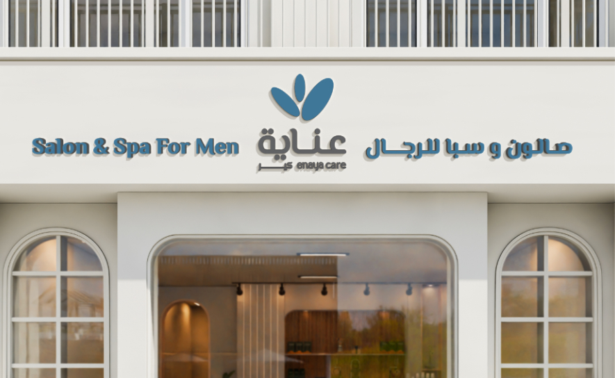
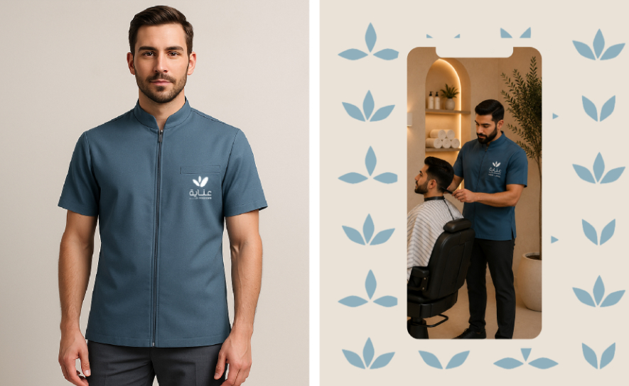
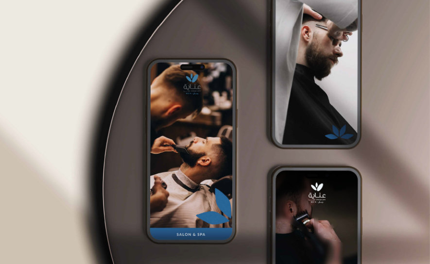
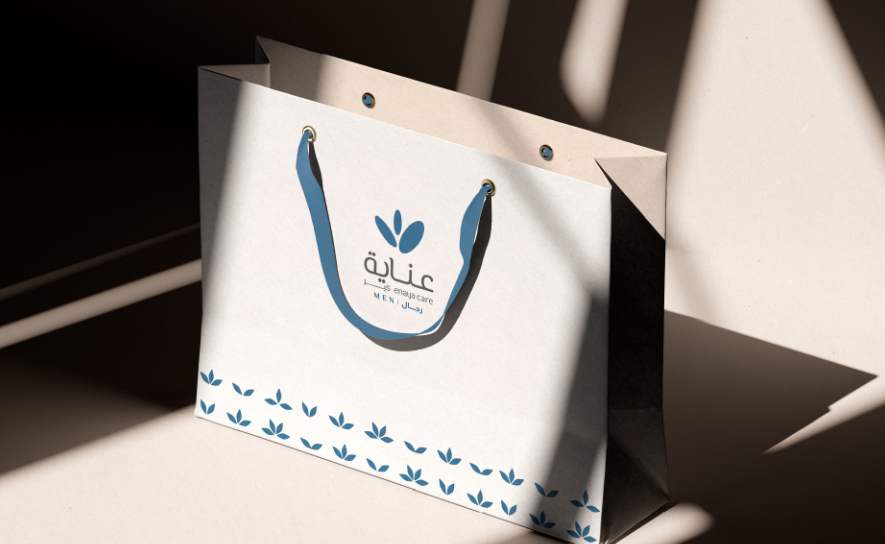
Enaya Care Men introduces a deep blue palette paired with crisp, structured visuals. The refined identity projects a sharp, modern, and premium barbershop and spa experience across storefronts, staff uniforms, and digital content.
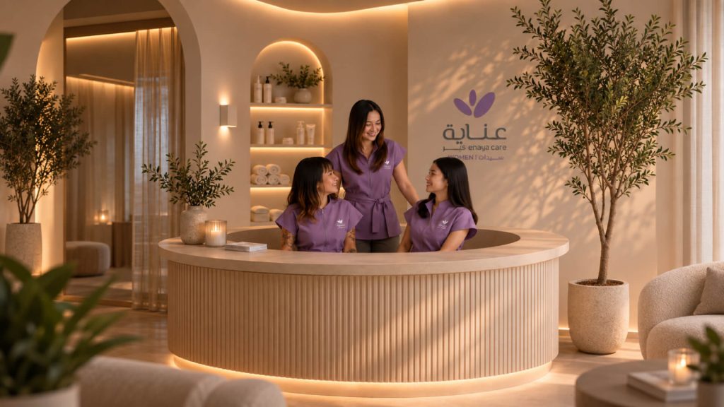
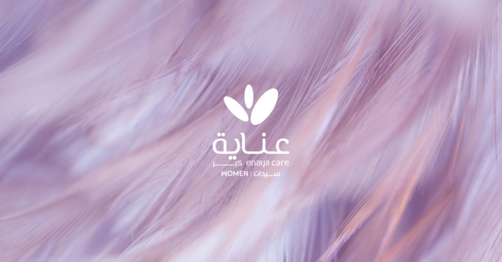
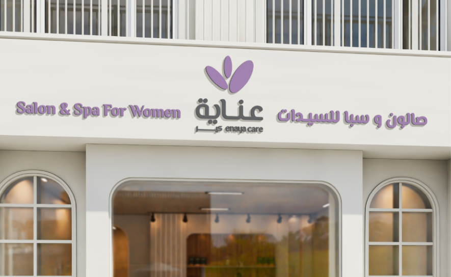
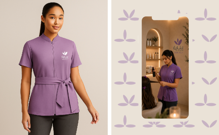
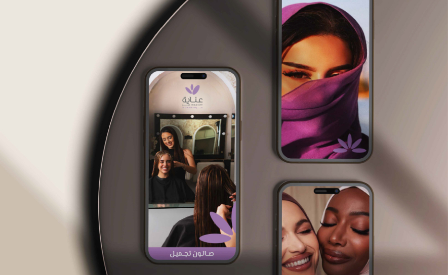
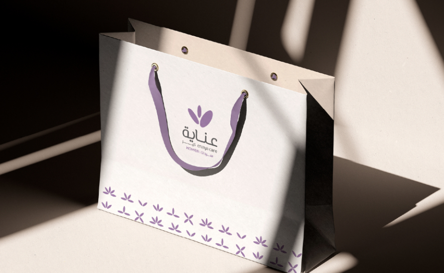
Enaya Care Women uses soft purple tones and fluid, organic shapes to convey elegance and tranquility. The visual system extends seamlessly across salon interiors, packaging, and beauty touchpoints to deliver a calm, upscale wellness experience.
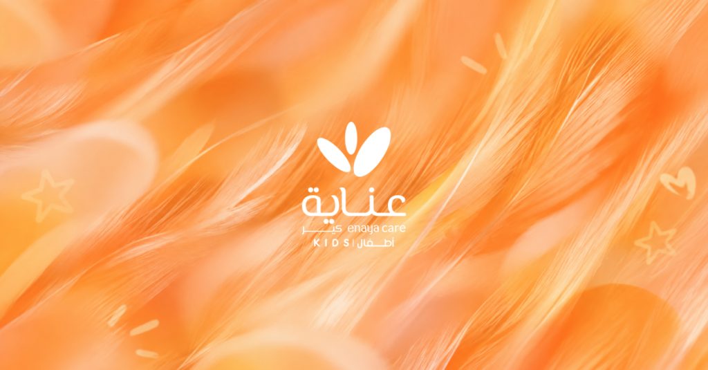
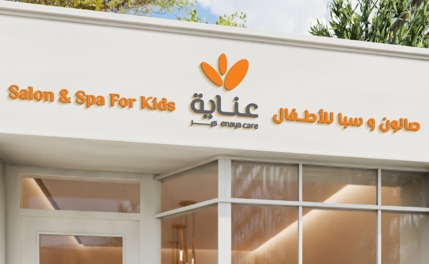
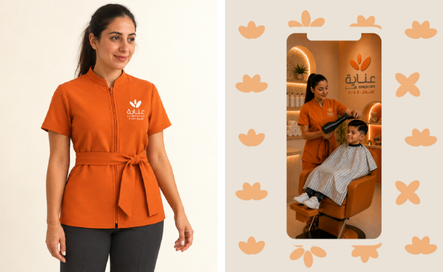
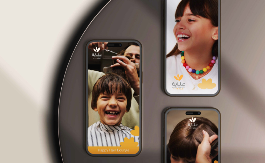
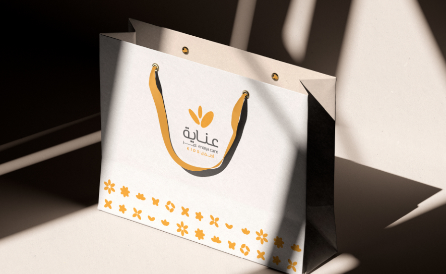
Enaya Care Kids brings a warm and lively energy to the brand with a vibrant orange palette, star motifs, and friendly rounded graphics. The playful identity transforms the salon experience into an inviting, engaging environment built specifically for children.
The result is a connected brand ecosystem built around three distinct audiences. Men, Women and Kids each have their own personality and visual language, while a shared identity maintains consistency across the complete Enaya Care experience.